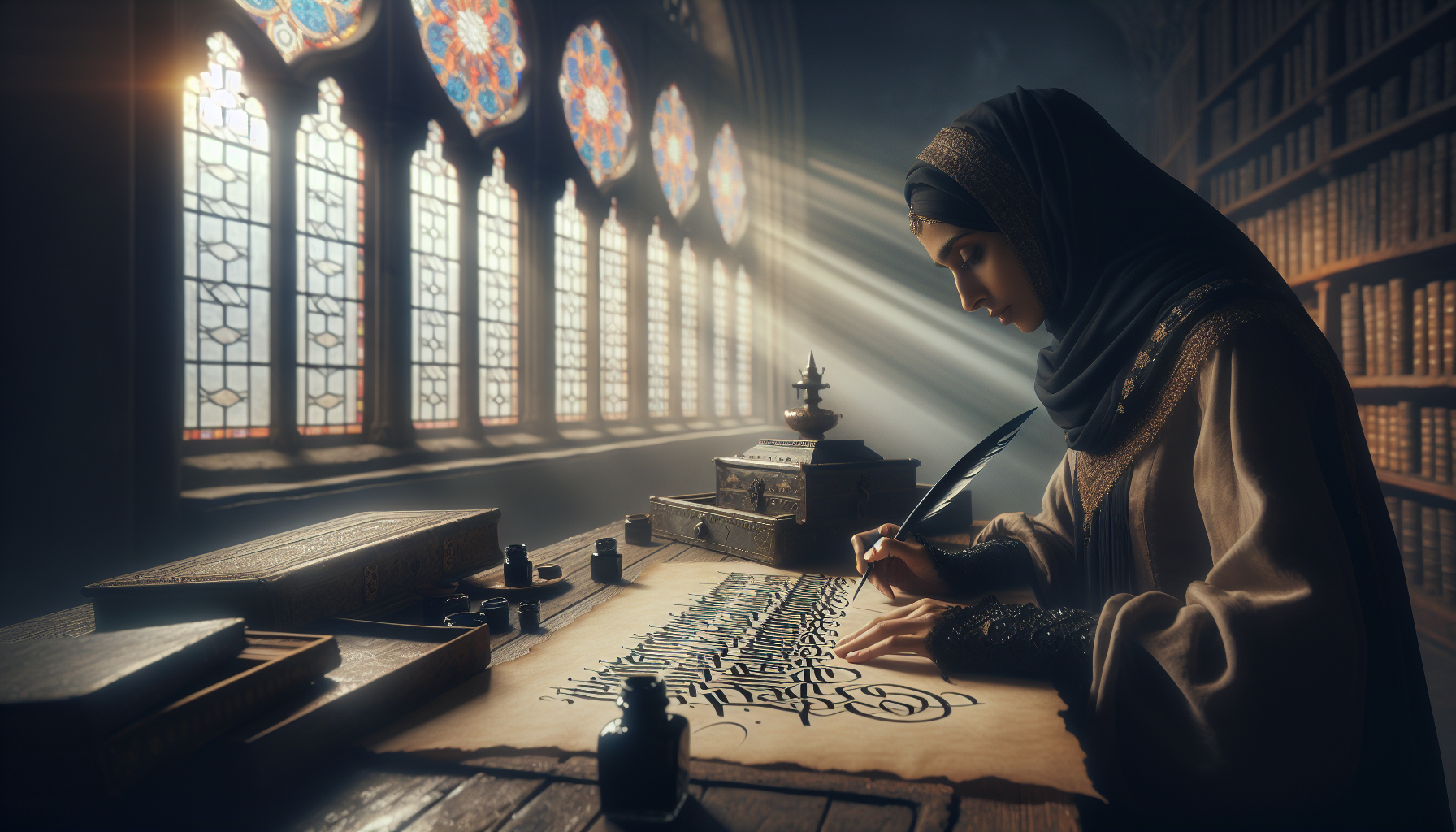
In the intricate tapestry of calligraphy, one style stands out with a haunting allure that has captivated audiences for centuries: Gothic lettering. With its dramatic flourishes and bold, intricate designs, this form of script evokes an enigmatic elegance that is as visually striking as it is historically rich. As we journey through the corridors of time, Gothic lettering reveals itself not merely as an art form but as a living testament to cultural evolution, societal shifts, and the unyielding human quest for expression. This article delves deep into the heart of Gothic lettering, unraveling its mystique, exploring its profound impact on art and society, and examining its continued functionality in modern times. 📜
The origin of Gothic lettering is a story steeped in the annals of history, a tale that begins in the cloistered halls of medieval Europe. Born from the need for a script that could accommodate the growing complexity of Latin manuscripts, Gothic script emerged as both a practical solution and an artistic revolution. It quickly became the preferred style for scribes and scholars, its angular forms and dense texture perfectly suited to the vellum pages of illuminated manuscripts. However, the influence of Gothic script transcended the written word. It became an emblem of identity and power, etched into the stones of cathedrals and echoed in the art and architecture of the age. In this exploration, we will uncover the origins and evolution of this iconic script, offering insights into how it shaped, and was shaped by, the world around it.
Yet, the story of Gothic lettering is not confined to dusty tomes and ancient stones. Its resurgence in the modern era is a testament to its enduring appeal and versatility. From the rebellious strokes of punk rock album covers to the elegant lines of wedding invitations, Gothic script has reinvented itself, finding relevance in diverse cultural and social contexts. This section of our journey will delve into the ways in which Gothic lettering has been appropriated and adapted, exploring its influence across different mediums and its ability to convey powerful messages in both traditional and contemporary settings. Whether as a symbol of rebellion or a mark of sophistication, the functionality of Gothic lettering continues to evolve, demonstrating its remarkable adaptability.
As we navigate through the layers of history and culture, we will also examine the technical intricacies that define Gothic lettering. From the precision of pen angles to the meticulous formation of each letter, the craftsmanship involved in mastering this script is an art in itself. We will provide a closer look at the techniques and tools used by calligraphers, offering a glimpse into the dedication and skill required to breathe life into each stroke. By understanding these technical elements, readers will gain a deeper appreciation for the artistry involved and the enduring beauty that makes Gothic lettering a timeless treasure. Join us on this captivating exploration as we uncover the elegance and impact of Gothic lettering, celebrating its legacy and unveiling its secrets one stroke at a time. 🖋️
The Historical Roots of Gothic Lettering
Gothic lettering, also known as Blackletter, is a style of script that originated in Western Europe during the Middle Ages. Its unique, intricate designs have made it a subject of admiration and study, standing the test of time with its distinct characteristics. Historically, Gothic lettering emerged around the 12th century and was predominantly used in religious manuscripts, literature, and official documents. The script is characterized by its bold, dense lines and dramatic flourishes, embodying a sense of gravity and elegance that captured the imagination of scholars and artists alike.
The origins of Gothic lettering can be traced back to the need for a uniform writing style that could be easily replicated by scribes across Europe. As literacy began to spread, so did the necessity for books that were consistent in style and legibility. Monasteries, which were the primary centers of learning and book production at the time, adopted Gothic lettering because its angular and compact style allowed for more text to fit on a single page. This was particularly useful for the large-scale production of Bibles and religious texts, which were in high demand.
As the Gothic style evolved, it diversified into several substyles, each with its own unique features. For instance, the Textura style is noted for its narrow, tightly spaced letters, making it one of the most challenging forms to read. In contrast, the Rotunda style offers rounder, more open forms that provide easier readability. Despite these variations, all Gothic scripts share a common aesthetic that is both dramatic and ornate, contributing to their lasting appeal.
The Cultural Significance and Aesthetic Appeal
The cultural significance of Gothic lettering extends beyond its historical roots. Its aesthetic appeal is deeply interwoven with cultural movements and artistic expressions. During the Renaissance, Gothic lettering experienced a decline in favor due to the rise of humanist scripts that emphasized clarity and simplicity. However, its dramatic and artistic nature found new life in the Romantic period of the 18th and 19th centuries, when artists and writers sought to reconnect with the medieval past as a source of inspiration.
Gothic lettering has also played a pivotal role in cultural identity and national pride. In Germany, for example, the Fraktur style of Gothic lettering became a symbol of German nationalism and was widely used in newspapers, official documents, and even on currency. This association with cultural heritage highlights the enduring impact of Gothic lettering in shaping societal narratives and identities.
Today, the aesthetic appeal of Gothic lettering can be seen in a variety of modern applications, from tattoo designs to album covers, and even in fashion. Its intricate designs and historical connotations make it a popular choice for artists and designers seeking to convey a sense of mystery, elegance, and timelessness. The resurgence of interest in vintage and retro styles has further cemented the relevance of Gothic lettering in contemporary visual culture.
The Functionality of Gothic Lettering in Modern Design
In contemporary design, Gothic lettering is often used to create a sense of authenticity and craftsmanship. Its ornate details and historical significance provide a unique texture that stands out in a digital age dominated by sleek, minimalist aesthetics. Graphic designers and typographers utilize Gothic lettering to add depth and character to their work, ensuring that each piece is both visually striking and contextually relevant.
Moreover, the versatility of Gothic lettering allows it to be adapted for various modern applications. Whether it’s used in branding, packaging, or digital media, the distinctive appearance of Gothic script can evoke emotions and convey messages that resonate with audiences on multiple levels. The boldness and clarity of the script also make it an effective tool for emphasizing key points and drawing attention in a crowded visual landscape.
For those interested in exploring the beauty and intricacies of Gothic lettering, here is an engaging video that delves deeper into its art and history: Gothic Calligraphy: An Introduction by The Calligraphy Channel. 🎨
Comparative Table of Gothic Lettering Styles
To better understand the various styles of Gothic lettering, consider the following comparative table that highlights key differences:
| Style | Characteristics | Usage |
|---|---|---|
| Textura | Narrow, dense, and highly angular | Religious texts and manuscripts |
| Rotunda | Rounder, more open forms | Italian manuscripts and literature |
| Fraktur | Bold, decorative with a nationalistic flair | German print media and official documents |
As you can see, each style has its unique features and historical significance, contributing to the rich tapestry of Gothic lettering’s legacy.
The Influence of Gothic Lettering on Typography
Typography as an art form has been profoundly influenced by the traditions of Gothic lettering. The characteristics that define Gothic scripts—such as their weight, angularity, and elaborate detail—have inspired countless typographers to experiment with form and function. This influence is evident in the creation of typefaces that blend historical elements with modern sensibilities, resulting in fonts that are both nostalgic and contemporary.
Modern typography often incorporates elements of Gothic design to create fonts that are versatile and visually engaging. These fonts are used across various media, from print to digital platforms, providing designers with tools to evoke specific moods and themes. For instance, Gothic-inspired typefaces are commonly employed in horror genres, fantasy settings, and historical contexts to create an atmosphere that is both immersive and evocative.
Furthermore, the digital revolution has opened new avenues for exploring Gothic lettering, enabling designers to push the boundaries of traditional scripts through the use of software and technology. This innovation has allowed for the creation of dynamic, interactive typography that can adapt to various contexts and devices, ensuring that the legacy of Gothic lettering continues to evolve and thrive in the digital age.
Top Uses of Gothic Lettering in Modern Media
The impact of Gothic lettering can be seen in several modern media applications:
- Branding: Gothic lettering is often used in logos and branding to convey a sense of tradition, reliability, and timelessness.
- Fashion: The ornate and dramatic style of Gothic scripts has been embraced by the fashion industry, appearing in everything from clothing designs to accessory embellishments.
- Entertainment: Movies, video games, and television shows frequently utilize Gothic lettering to set the tone for fantasy and historical narratives.
These uses highlight the enduring appeal and versatility of Gothic lettering, proving that its elegance and functionality continue to captivate audiences worldwide.
Conclusion
Unveiling the elegance of Gothic lettering has been an enlightening journey through time, art, and cultural significance. Throughout this article, we’ve explored the intricate history, aesthetic allure, and functional versatility of this distinctive style of writing. Gothic lettering, with its roots in the medieval period, transcends mere typography to encapsulate a rich tapestry of cultural and artistic evolution.
The article began by tracing the origins of Gothic lettering, which emerged in the Middle Ages as a dominant style of script across Europe. Known for its ornate and bold characters, Gothic lettering was initially used in religious manuscripts, bringing an air of solemnity and reverence to sacred texts. This historical context is vital for understanding the depth and resilience of this art form. As we delved deeper, we observed how this style spread beyond religious texts to other areas, such as official documents and early printed books, reflecting its adaptability and enduring appeal.
We then discussed the visual aesthetics that make Gothic lettering so captivating. The style is characterized by its dense, dark appearance, and intricate details, often incorporating elaborate embellishments. This visual complexity not only catches the eye but also conveys a sense of gravitas and authority, which has made it a favorite for various artistic and commercial applications over the centuries. The timeless beauty of Gothic script lies in its ability to balance complexity with clarity, providing both visual interest and readability.
The article also examined the modern resurgence of Gothic lettering, highlighting its influence in contemporary design and typography. Today, it is not uncommon to see Gothic-inspired fonts in branding, fashion, and digital media. This resurgence speaks to the style’s adaptability and its ability to evoke emotion and tradition while still remaining relevant in modern contexts. Whether used to evoke nostalgia, convey sophistication, or add a touch of drama, Gothic lettering continues to captivate designers and audiences alike.
Furthermore, the functionality of Gothic lettering was a key point of discussion. Beyond its aesthetic value, Gothic lettering serves a practical purpose in communication, particularly in contexts that require a sense of formality or historical reference. Its use in tattoos, for example, often carries personal significance, with individuals choosing this style to convey messages of importance or personal identity.
The impact of Gothic lettering on cultural and artistic landscapes cannot be overstated. It has inspired countless artists and designers to experiment with form and function, pushing the boundaries of what typography can achieve. This style’s resilience and adaptability have allowed it to remain a staple in both traditional and contemporary applications, bridging the gap between past and present.
As we conclude our exploration of Gothic lettering, it is important to reflect on the broader implications of this art form. It serves as a testament to the power of design to transcend time and cultural shifts, maintaining relevance and impact through centuries. This discussion encourages us to appreciate the intricate craftsmanship and historical significance embedded in each stroke of Gothic script. It invites us to ponder how art and design influence our perceptions and experiences.
We invite you, dear reader, to carry this appreciation forward. Consider how you might incorporate the elegance and complexity of Gothic lettering into your own creative endeavors or everyday life. Whether you are a designer, artist, or simply an admirer of beautiful typography, there is much to learn and draw inspiration from in the world of Gothic lettering.
Feel free to share your thoughts and experiences with Gothic lettering in the comments below. How does this style influence your perception of text and design? Have you used Gothic lettering in your own work, and if so, what impact did it have? Your insights and stories are invaluable to the ongoing conversation about the role of typography in our lives.
In closing, Gothic lettering is more than just a style of writing; it is a bridge to our cultural heritage and a versatile tool for modern expression. Its elegance and functionality continue to inspire and captivate, proving that some art forms truly stand the test of time. Let us celebrate this enduring legacy and explore the possibilities it offers for the future of design.
Thank you for joining us on this journey through the elegant world of Gothic lettering. We hope you found inspiration and knowledge that will spark your own creative explorations. Please feel free to share this article with fellow enthusiasts and continue the conversation about this fascinating art form. Together, let’s keep the legacy of Gothic lettering alive and thriving! ✨
For further reading and research on Gothic lettering and its impact, you can explore resources such as the Metropolitan Museum of Art and the Getty Research Institute, which offer valuable insights and historical context on this timeless art form.

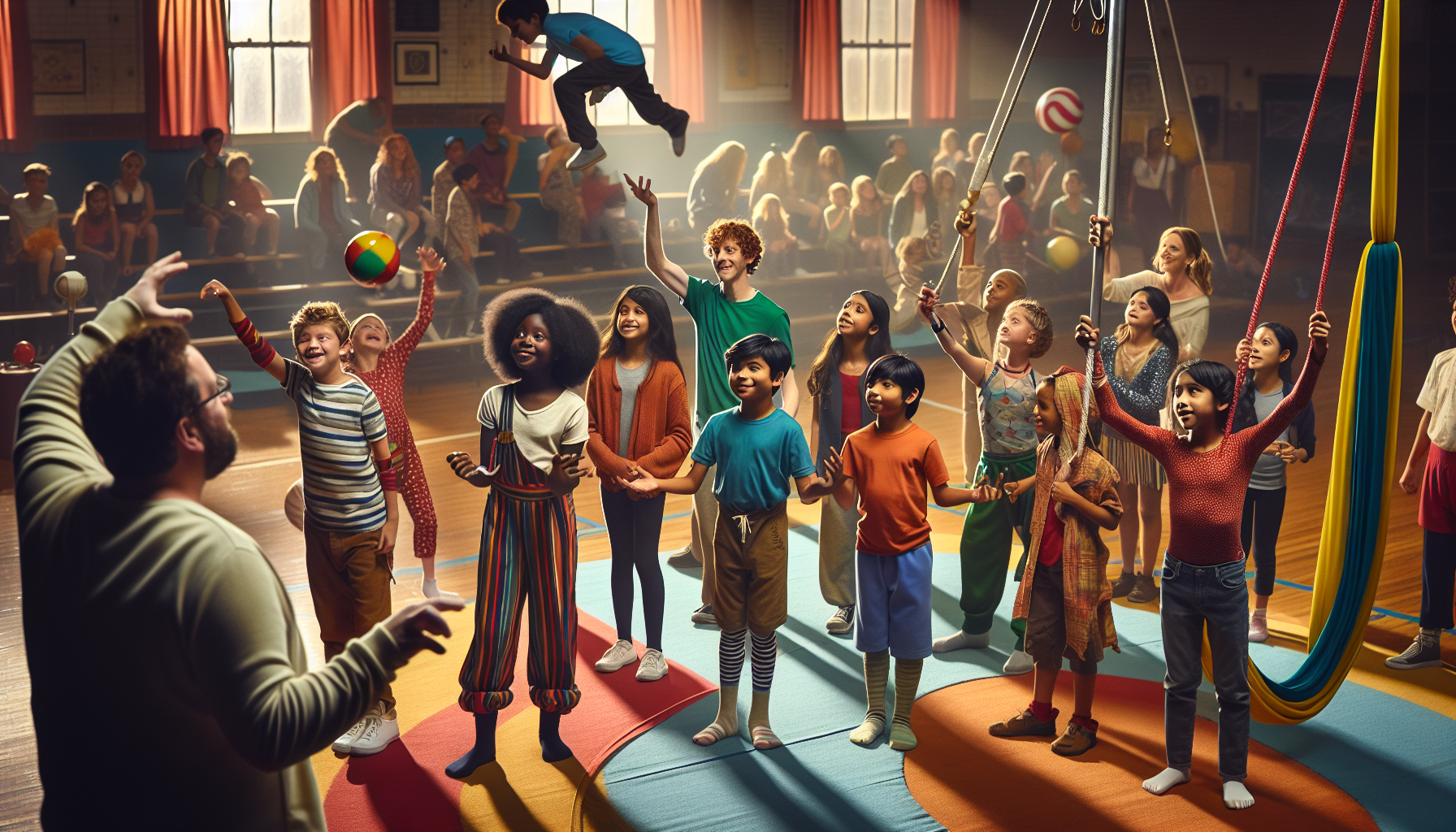
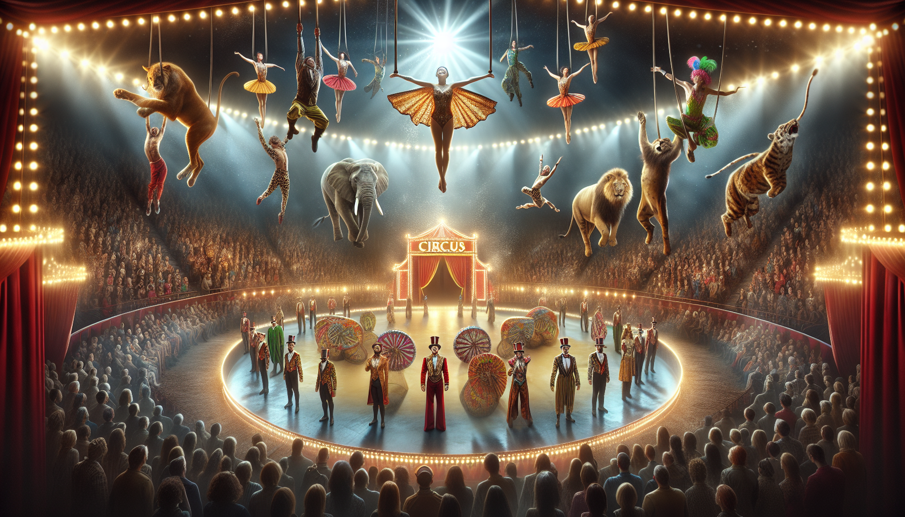
Toni Santos is a visual storyteller and archival artisan whose creative journey is steeped in the bold colors, dramatic typography, and mythic imagery of old circus posters. Through his artistic lens, Toni breathes new life into these once-lurid canvases of wonder, transforming them into tributes to a golden era of spectacle, showmanship, and cultural fantasy.
Fascinated by the visual language of vintage circuses — from roaring lions to gravity-defying acrobats, from hand-painted banners to gothic typefaces — Toni explores how these posters once captured the imagination of entire towns with nothing more than ink, illusion, and a promise of awe. Each composition he creates or studies is a dialogue with history, nostalgia, and the raw aesthetics of entertainment on the move.
With a background in handcrafted design and visual heritage, Toni blends artistic sensitivity with historical insight. His work traces the forgotten typographies, chromatic choices, and symbolic flair that defined circus marketing in the 19th and early 20th centuries — a time when posters were not just advertisements, but portable portals to dreamworlds.
As the creative force behind Vizovex, Toni curates collections, illustrations, and thoughtful narratives that reconnect modern audiences with the magic of old circus art — not just as ephemera, but as cultural memory etched in paper and pigment.
His work is a tribute to:
The flamboyant storytelling of early circus posters
The lost art of hand-lettered show promotion
The timeless charm of visual fantasy in public space
Whether you’re a vintage print enthusiast, a circus history lover, or a designer inspired by antique aesthetics, Toni invites you into a world where tigers leap through fire, strongmen pose in perfect symmetry, and every corner of the poster whispers: Step right up.