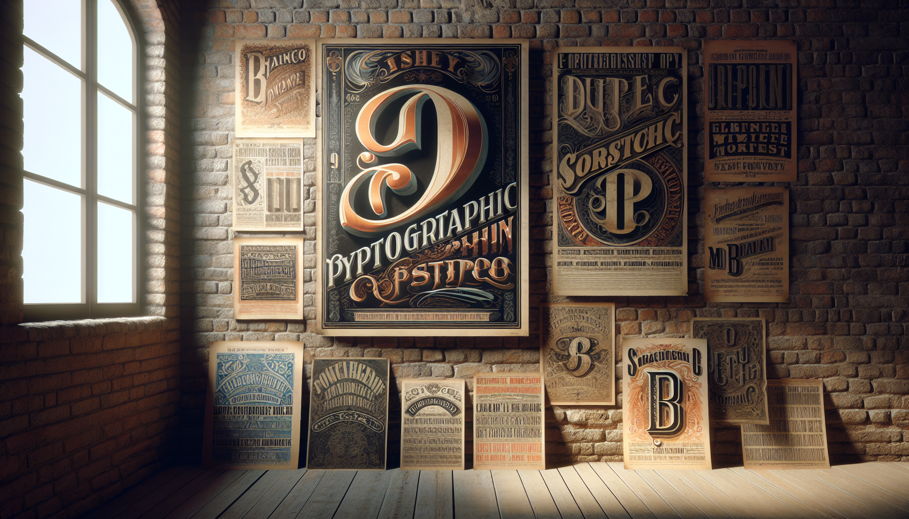
In the bustling realm of design, where innovation and technology often steal the spotlight, there lies a timeless allure in revisiting the artistic expressions of the past. One such fascinating journey takes us back to the 19th century—a period marked by profound transformation and creativity. Amidst the industrial boom and societal shifts, a distinct art form flourished: the typographic styles of 19th-century posters. These vintage vibes not only capture the essence of an era but also serve as a wellspring of inspiration for modern designers. In this blog, we’ll delve into the captivating world of 19th-century typography, exploring its rich history, unique characteristics, and enduring influence on contemporary design.
The 19th century was a time of significant change, characterized by rapid advancements in printing technology and an explosion of visual communication. The invention of the steam-powered printing press revolutionized the production of posters, making them an essential medium for advertising and information dissemination. As businesses vied for the public’s attention, the competition sparked a creative renaissance in typography. Designers experimented with bold, intricate fonts and elaborate layouts, resulting in posters that were not only functional but also works of art in their own right. Each poster told a story, capturing the zeitgeist of the time and reflecting the cultural and social dynamics of the era.
One of the most intriguing aspects of 19th-century typographic styles is their diversity. From the ornate and decorative typefaces that adorned circus posters to the bold, slab serifs used in political campaigns, the era was a melting pot of styles and influences. The advent of lithography and chromolithography further expanded the possibilities, allowing for vibrant color combinations and intricate detailing. As we explore these typographic treasures, we’ll uncover the stories behind some of the most iconic designs, examining how they were crafted and the messages they conveyed. We’ll also discuss the role of typography in shaping public opinion and its impact on the visual culture of the time.
Fast forward to today, and the echoes of 19th-century typography can still be seen in modern design. Whether it’s the resurgence of vintage-inspired branding or the incorporation of classic typefaces in digital media, the influence of this bygone era is undeniable. By examining the typographic styles of the 19th century, we can gain valuable insights into the principles of design that transcend time. This exploration not only enriches our understanding of the past but also inspires us to create with renewed purpose and creativity. So, let’s embark on this journey through time and type, discovering the vintage vibes that continue to shape our visual world. ✨📜
The Art of 19th-Century Typography: An Introduction
The 19th century was a transformative era for typography, marked by significant advancements in printing technology and an explosion of creativity in typographic design. During this period, posters emerged as a powerful medium for communication, advertising, and art, utilizing typography in innovative ways to capture the public’s attention. As we delve into the typographic styles of 19th-century posters, we explore the interplay between aesthetics and functionality that defined this fascinating era.
Typography in the 19th century was not just about conveying information; it was about making a statement. The invention of the steam-powered printing press allowed for faster and more economical production of printed materials, leading to a surge in demand for eye-catching posters. This demand drove typographers to experiment with bold, decorative typefaces that would stand out in the bustling urban landscapes of the time.
One of the defining characteristics of 19th-century typographic style was its eclecticism. Designers drew inspiration from a wide range of sources, including classical Roman and Greek motifs, medieval scripts, and the burgeoning Art Nouveau movement. This blend of influences resulted in a rich tapestry of typographic styles that reflected the cultural and artistic trends of the time.
Technological Innovations and Their Impact
The 19th century saw numerous technological innovations that had a profound impact on typography. The introduction of the steam-powered printing press revolutionized the printing industry, allowing for mass production of posters and other printed materials. This advancement made it possible to produce high-quality prints at a fraction of the previous cost, democratizing access to printed media and fueling the demand for striking typographic designs.
Another key development was the advent of lithography, a printing technique that enabled artists to create detailed and colorful prints. Lithography allowed for greater freedom in design, as it could reproduce intricate illustrations and typefaces with precision. This technique was particularly popular for creating theatrical posters, which often featured elaborate typefaces and vibrant imagery to attract audiences.
Additionally, the introduction of new typefaces played a significant role in shaping the typographic landscape of the 19th century. Type foundries began producing an array of decorative typefaces, each with its own unique character and style. These typefaces were often used in combination, creating visually dynamic compositions that captivated viewers and conveyed a sense of excitement and novelty.
Exploring Popular Typographic Styles
The 19th century was a period of stylistic experimentation in typography, with designers drawing on diverse influences to create visually arresting compositions. Several typographic styles emerged during this era, each with its own distinctive features and cultural significance. From the ornate elegance of Victorian typography to the bold simplicity of early industrial typefaces, these styles reflect the evolving tastes and societal changes of the time.
One of the most iconic styles of the 19th century was Victorian typography, characterized by its elaborate ornamentation and intricate details. Victorian typefaces often featured ornate flourishes, intricate borders, and decorative elements that reflected the opulence and grandeur of the Victorian era. This style was commonly used in advertisements, event posters, and book covers, where its decorative appeal could draw in viewers and convey a sense of luxury and sophistication.
In contrast, the rise of industrialization in the 19th century led to the development of more utilitarian typefaces. These industrial typefaces were characterized by their bold, blocky letters and straightforward design, which made them ideal for conveying information quickly and clearly. These typefaces were often used in advertising and signage, where their legibility and impact were crucial for catching the eye of passersby in bustling urban environments.
The Influence of Art Movements
The typographic styles of the 19th century were heavily influenced by contemporary art movements, which brought new ideas and aesthetics to the world of design. One of the most significant influences was the Art Nouveau movement, which emerged in the late 19th century and was characterized by its organic forms and flowing lines. Art Nouveau typefaces often incorporated curvilinear shapes and natural motifs, creating a sense of harmony and elegance that contrasted with the rigid structures of industrial typefaces.
Another important influence was the Gothic Revival, which drew inspiration from medieval manuscripts and architecture. Gothic typefaces featured pointed arches, elaborate letterforms, and intricate details that evoked a sense of history and tradition. This style was particularly popular in religious and historical contexts, where its associations with the past added depth and meaning to the text.
To further understand these influences, you can watch the following video that explores the impact of art movements on 19th-century typography: Typography and Art Movements in the 19th Century – Art Channel. This video provides an insightful overview of how different artistic trends shaped the typographic styles of the era.
Comparative Analysis of Typographic Styles
To appreciate the diversity of 19th-century typography, it’s helpful to compare the various styles that emerged during this period. Each style had its own unique characteristics and served different purposes, reflecting the cultural and technological changes of the time. The table below provides a comparative analysis of some of the most prominent typographic styles of the 19th century.
| Style | Characteristics | Common Uses |
|---|---|---|
| Victorian | Ornate, elaborate flourishes, decorative elements | Advertisements, event posters, book covers |
| Industrial | Bold, blocky letters, utilitarian design | Advertising, signage, newspapers |
| Art Nouveau | Organic forms, flowing lines, natural motifs | Art posters, decorative arts, luxury goods |
| Gothic Revival | Pointed arches, elaborate letterforms, intricate details | Religious texts, historical documents, architecture |
By examining these styles side by side, we gain a deeper understanding of the rich typographic landscape of the 19th century. Each style reflects a unique blend of artistic influence and technological innovation, capturing the spirit of an era that was both dynamic and diverse.
For a more detailed exploration of these styles, consider exploring additional resources and videos that delve into the history and evolution of typography. By immersing yourself in the world of 19th-century typographic design, you’ll gain a greater appreciation for the creativity and craftsmanship that defined this fascinating period in history.
The Legacy of 19th-Century Typography
The typographic styles of the 19th century have left a lasting legacy on the world of design, influencing countless designers and typographers in the decades that followed. The bold experimentation and eclecticism of this era set the stage for future innovations in typography, paving the way for new styles and techniques that continue to shape the field today.
One of the key contributions of 19th-century typography was its emphasis on the visual impact of type. Designers of the time recognized the power of typography to convey meaning and emotion, and they used this knowledge to create designs that were not only functional but also visually striking. This focus on the aesthetic potential of type has continued to inspire designers to this day, encouraging them to push the boundaries of what typography can achieve.
The legacy of 19th-century typography can also be seen in the continued popularity of many of its styles. Victorian and Art Nouveau typefaces, for example, remain popular choices for designers seeking to evoke a sense of elegance and sophistication. Similarly, the bold simplicity of industrial typefaces has influenced modern design trends, with many contemporary typefaces drawing inspiration from the straightforward, no-nonsense approach of their 19th-century predecessors.
In conclusion, the typographic styles of the 19th century represent a rich and diverse chapter in the history of design. By exploring these styles and their influences, we gain a deeper appreciation for the creativity and innovation that defined this era, as well as the enduring impact of 19th-century typography on the world of design.
Conclusion
Conclusion: Embracing the Timeless Charm of 19th-Century Typographic Styles
As we draw to a close on our exploration of 19th-century typographic styles, it’s evident that this period was not just a chapter in design history but a cornerstone that continues to influence modern aesthetics. The journey through the intricate details of vintage posters reveals a world where typography was not merely functional but a powerful tool of artistic expression. From the ornate serifs to the bold sans-serifs, every typeface tells a story of its own, mirroring the societal changes and technological advancements of its time.
Throughout this article, we’ve delved into the key elements that make 19th-century typography so distinctive. We examined how industrialization spurred the development of new printing technologies, allowing for more elaborate and expressive designs. The introduction of the steam-powered printing press was a game-changer, facilitating mass production and the dissemination of artistic poster designs that captured public attention. Each poster from this era, with its unique blend of style and substance, served a dual purpose: to inform and to captivate.
We also explored the aesthetic characteristics that define this era’s typography, such as the use of decorative borders, complex letterforms, and innovative layouts. These elements were not merely ornamental; they were carefully crafted to enhance the message and attract the viewer’s eye. The Victorian era, in particular, embraced this philosophy, leading to an explosion of creativity and diversity in poster design.
The cultural context of the 19th century played a crucial role in shaping these typographic styles. As literacy rates improved and urban populations grew, posters became an essential medium for communication, marketing everything from theatrical performances to political ideas. The eclectic mix of styles reflected the era’s spirit—an age of exploration, innovation, and transformation.
Understanding the historical context and design principles of these vintage typographic styles can provide invaluable insights for modern designers. Today, there’s a resurgence of interest in retro and vintage aesthetics, as seen in contemporary branding and digital design trends. By studying these historical styles, designers can draw inspiration to create works that are both nostalgic and fresh, merging the best of the past with the innovations of the present.
As you reflect on the captivating world of 19th-century typography, consider how these timeless designs can inform and inspire your own creative projects. Whether you’re a graphic designer, a historian, or simply a lover of vintage aesthetics, there’s a wealth of knowledge and inspiration to be gained from studying these classic styles.
I encourage you to dive deeper into this fascinating topic by exploring online archives and resources that showcase vintage poster designs. Websites like the Library of Congress and the Public Domain Review offer extensive collections of historical posters and typographic works. These platforms provide a window into the past, allowing us to appreciate the artistry and ingenuity of 19th-century designers.
In conclusion, the typographic styles of the 19th century remind us of the enduring power of design to communicate, captivate, and inspire. As we continue to navigate the ever-evolving landscape of design, let us draw lessons from the past to enrich our creative expressions. Feel free to share your thoughts and insights in the comments below, and don’t hesitate to share this article with fellow enthusiasts of vintage design. By doing so, we can keep the spirit of these timeless designs alive and thriving in our modern world. 🌟
Thank you for joining me on this journey through the vibrant world of vintage typography. Let’s continue to explore, create, and celebrate the artistry that transcends time.

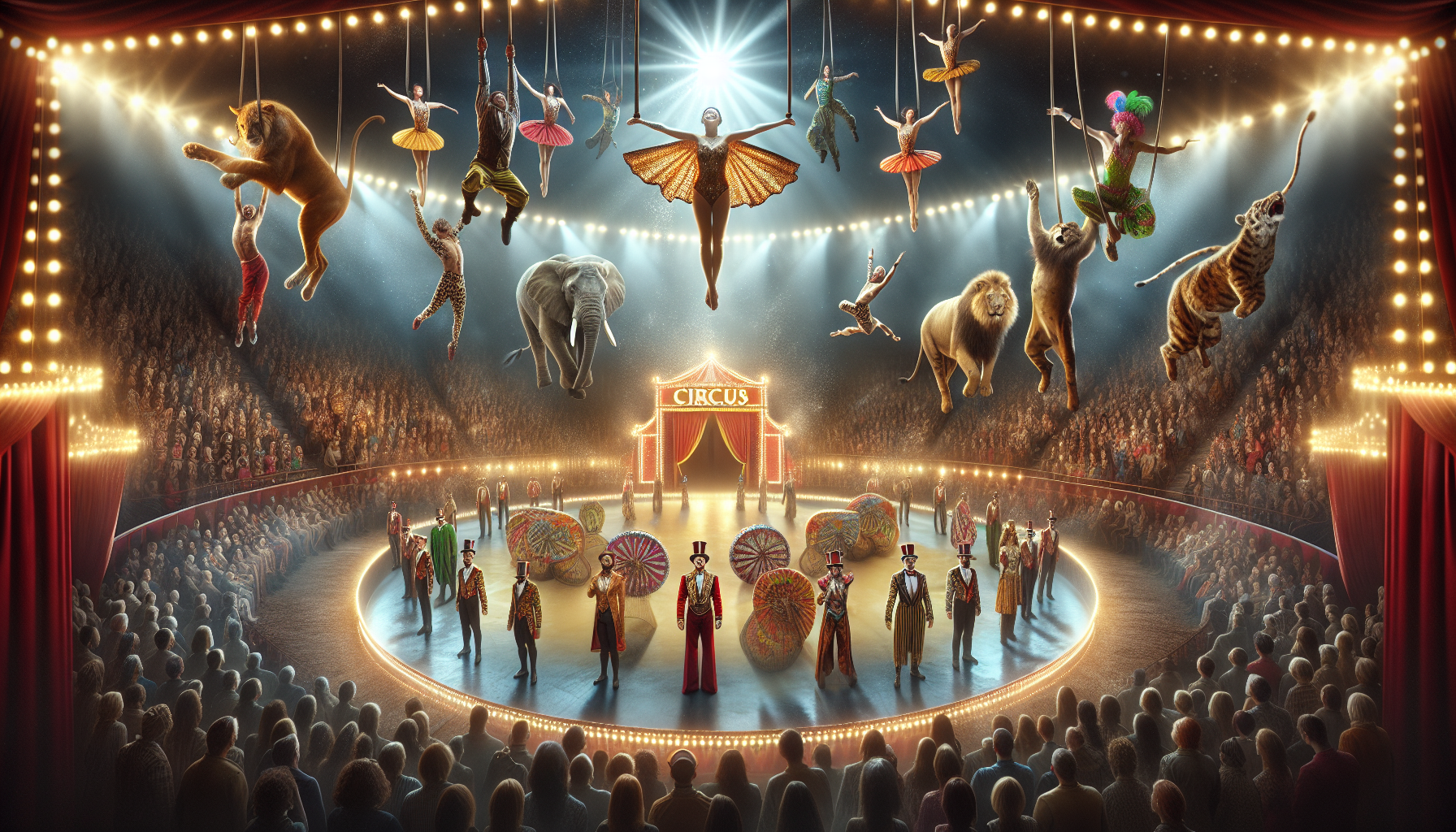
Toni Santos is a visual storyteller and archival artisan whose creative journey is steeped in the bold colors, dramatic typography, and mythic imagery of old circus posters. Through his artistic lens, Toni breathes new life into these once-lurid canvases of wonder, transforming them into tributes to a golden era of spectacle, showmanship, and cultural fantasy.
Fascinated by the visual language of vintage circuses — from roaring lions to gravity-defying acrobats, from hand-painted banners to gothic typefaces — Toni explores how these posters once captured the imagination of entire towns with nothing more than ink, illusion, and a promise of awe. Each composition he creates or studies is a dialogue with history, nostalgia, and the raw aesthetics of entertainment on the move.
With a background in handcrafted design and visual heritage, Toni blends artistic sensitivity with historical insight. His work traces the forgotten typographies, chromatic choices, and symbolic flair that defined circus marketing in the 19th and early 20th centuries — a time when posters were not just advertisements, but portable portals to dreamworlds.
As the creative force behind Vizovex, Toni curates collections, illustrations, and thoughtful narratives that reconnect modern audiences with the magic of old circus art — not just as ephemera, but as cultural memory etched in paper and pigment.
His work is a tribute to:
The flamboyant storytelling of early circus posters
The lost art of hand-lettered show promotion
The timeless charm of visual fantasy in public space
Whether you’re a vintage print enthusiast, a circus history lover, or a designer inspired by antique aesthetics, Toni invites you into a world where tigers leap through fire, strongmen pose in perfect symmetry, and every corner of the poster whispers: Step right up.